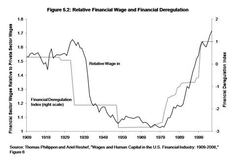
James Kwak, coauthor of the new financial crisis book 13 Bankers, recently sought to explain his thesis “in 4 pictures.” And impressive pictures they are. But I’ve been particularly struck by one of them — this chart, from a paper by economists Thomas Philippon and Ariell Reshef, showing the close correspondence between deregulation trends on the one hand and the ratio of financial sector wages to private sector wages on the other. My reaction to the chart was essentially, Huh. Those trend lines look like the basic income inequality trend line.
But to my knowledge, no one has really made this point since the chart has circulated widely. Certainly no one has tried to illustrate it.
Maybe people just lack my whiz-bang PowerPoint and Excel skills, or maybe I’ve actually had an Original Thought. But take a look at the chart I created, which overlays a trend line showing the share of income received by the top one percent (the black line) on top of the Philippon-Reshef chart. The trend line comes from the widely cited work of economists Thomas Piketty and Emmanuel Saez, who used IRS data to look at the incomes of the very rich:

I’ve argued before that I think the Piketty-Saez top-share trend line overstates the recent rise in income inequality, but I don’t see much reason to doubt the basic U-shape of the trend since the Great Depression. For all of the consensus around the basic inequality trend, there’s surprisingly little agreement or understanding as to why it looks the way it does (a major theme of Paul Krugman’s Conscience of a Liberal). Could it really be as simple as the extent of financial regulation? Every analyst bone in my body says this is too easy, but…but….
Of course, saying it’s all financial regulation trends isn’t necessarily inconsistent with Krugman-esque arguments that it’s all about changes in cultural acceptance of inequality. Maybe financial regulation flows from public attitudes about inequality.
Anyway, interesting — no?

